Behind the curtains tinkerings on the technical side of this blog are like waves — steadily coming and going every couple years. While actual blogging settled into a comfortable slumping break for a while, the work on a new generation of theme to dress it had marched on since about 2011.
Last evening I had switched from old ReStatement theme to the new Trident one, signifying both flip of an era and making a step out of slump.
Reflection on dead ends
ReStatement had suffered from being result of the goals achieved. It was the massive learning project and moving on from tinkering on existing theme to the true from–scratch development.
As I explored and implemented how to make WordPress themes in general it colored the results in general colors. ReStatement ended up:
- heavily columnized with three columns, two of them underused
- depending on elaborate menu for navigation
- heavily widgetized, with some pages being completely widget–driven
The were all the features that would have been completely at home in generic WordPress theme, meant for distribution. Alas they served less than well for what I now call “site theme”.
When identity of the theme and of the site are one and the same — it is what the attention should be on. In many ways such project is stepping away from “common” WordPress practices and plows its own path.
That was the kind of project I knew next theme will have to be.
Inspirations
The theme had started as running away from stuffy multicolumn–centric layout so characteristic for WordPress themes. It is what WordPress does well, so that is what developers do, so that is what WordPress does.
WordPress look, you know?
While I hadn’t had specific style in mind, the (slow) process coincided with resurgence of interest in minimalistic typography–centric writing online.
So I had slowly came to details which added to theme more fairly described as minimal rather than minimalistic and typography–aware rather than centric.
Trend aside it was influenced by the looks and layouts of technical blogs, such as those of:
Clean looks, calm colors, content first.
But what about Medium? Medium probably did a lot to fuel the readable content trend and I can only thank it for that. However I had never felt Medium to be a good example to base the personal site on. It manages to communicate content well to you, but at the same time disconnects you from the author of that content.
I can remember reading many great posts on Medium, but very few authors of those posts. It is centered on itself and, as far as content farming goes, that is good strategy. It was a strategy I tried to develop away from rather than towards.
Hybrid Wing — Bootstrap theme
Twitter Bootstrap took the world of web development by storm. I was months late to pick it up and look at version 1. But I hadn’t let it go since. I was always partial to constructors, the high level blocks that empower you to put together solutions fast yet in a myriad of flexible ways.
Bootstrap wasn’t to be the theme by itself, but it was immediate in for the ride.
Using Hybrid Core in ReStatement was unshakable benefit. It complemented WordPress theme development like nothing else I tried, with integrity and principles that always put it in league of its own.
To click two parts together was an obvious choice that became Hybrid Wing theme. It became my eternal development quest — looking, changing, exploring, updating through Bootstrap & Hybrid versions, and staying fluid, alternating growing with shrinking.
Hybrid Wing commits over years.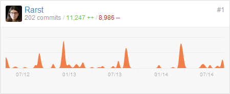
I called it a “toolkit theme”, something you use for other things — much like two projects in its foundation.
But through several attempts I had failed to launch off it a child theme to actually become the site.
Something was not working. Or rather something was missing.
Meadow — real templating
I first got interested in templating engines through the work of Cristi Burcă (as usual, his example had never led me wrong in development). He used mustache in his plugins and I quickly (in my memory that is, was probably quite a while) had adopted it for my own code.
The lean nature of mustache had never positioned it as candidate for theme development in my mind. And around it the power of popular Twig templating engine scared me off as way too much for plugin development.
And then somehow the dots connected. I had no deep interest in WordPress templating, neither was my interest in templating engines overwhelming. Combining the two sparked like the idea I could do nothing about but to make happen.
There had been multiple takes on templating engines (all and each) with WordPress before. For Twig specifically I had brushed through half a dozen projects at least and Timber seemed to have been succeeding in practical application.
Every time I stumbled in these solutions over the common theme of letting WordPress templating go. Doing things the “other” way.
Meadow synthesized its own path, balancing carefully between the new concept and familiarity of WordPress ways.
{% loop %}
    <h2><a href="{{ the_permalink() }}">{{ the_title() }}</a></h2>
    {{ the_content() }}
{% endloop %}
It moved from idea to reality to being part of Hybrid Wing.
It clicked. Gosh, did it click.
Putting Trident together

The new child theme was in the works and it was clearly taking off like none before it.
It didn’t have a name at first, jumping between candidates in my mind without much commitment. I was pacing kitchen one day and reflected on how well the layeredness of multiple solutions was working out together:
- readily serving bits of WordPress, Bootstrap, and Hybrid Core
- LESS styles, taking the grief out of CSS challenges
- Twig, shaping the templates at unparalleled speed and ease
I suppose if I was hungry in that moment I would have named it Cake. I was full and the world around was on my mind more than usual this year. And I had a thought and went with it — and it was named Trident, after coat of arms of Ukraine.
Typography woes
One problem with content in focus was content in focus. There was little left to distract from it and a lot left to figure out about typography. Ouch.
I was pretty set against web fonts. They are fantastic and popular technique, but so often I see them used irresponsibly and ruining web pages from poor performance to texts that plain cannot be read.
Something more boring and traditional would do, but what? I thought backwards about how I read. My old (and horribly unstable) book reader had been set to Verdana since it got ability to choose fonts at all with firmware updates. I had read literally millions of words in that font and it was solid personal choice to go with.
Font choice was least of my problems. Responsive multi–sized nature of Bootstrap was most of it. I looked for mathematical solutions, such as golden ratio typography, and was disappointed. I looked for dynamic adaptive options, such as FlowType.js, and was not happy with results.
The one influence that did work out (partially) was setting a text to vertical rhythm and math for that had near fried my brain.
What solved it? Nothing but iterating, iterating, and iterating again, until I was reasonably happy with how text looked. As boring as that.
Upfront page
I had to think a lot about direction I am taking the blog part of the site. I had concerns about classical approaches both as blogger and blog reader. The chronological views, that are hard to explore for any blog but the tiniest ones. The tip of the iceberg home pages, rarely explaining the site as well as they should.
I ended up taking the two structural parts that worked very well (my archives and about pages) and stirring them up for a new and very custom front page. It came out pretty laconic and sliced up in few smallish sections by grid and that was everything about the site that I wanted to put forward.
I had no clear idea for solving archive challenges. I experimented on a whim and after trying this and that I came to super dense table layout (yes, table) for them. Still more curious than certain about it.
Things undone
I had the idea to launch theme before attending WordCamp Europe 2013, to not have something that dated as my primary web presence.
Realizing WordCamp Europe 2014 is around the corner and it still isn’t up was bit of wake up call. :)
So I moved in with what I had, plowing through last of challenges and giving up through dreamy backlog of features. What went live is probably about 25% of things I wanted functionally–speaking.
And that is fine. It is here, it works. It is full of opportunities to improve for good couple of years before it’s time for a new theme grand project.
It’s in and on
I had primarily developed Trident on test data and only set it up on live server late in the process. Then I had sneakily enabled it for me alone and took a trip through the Rarst.net archives.
It felt like home. It felt like it has always been here.
Jenny Beaumont #
Rarst #