#StandWithUkraine

Readable – better reading experience bookmarklet

Readability had been my bookmarklet of choice for getting web pages to a state where they look like something you would actually want to read. There had been plenty of developments to its story, but personally I hadn’t quite got into their latest web-service-like version.

I have known Readable as long (since I wrote about both), but in same time it seems to have travelled opposite direction – closer to my tastes and needs for reading bookmarklet.

What it does

The purpose of Readable is to clean up current web page for maximum reading comfort. You start by configuring parameters to your liking and then save bookmarklet to use when you need it.

readable_interface

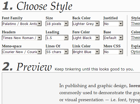
Current customization range is very strong and gives a lot of control over typography, including quite a selection of fonts (powered by Google Web Fonts).

Strong features

Settings cater to everyone, from less typography-inclined (like yours truly) with ready-made font and color schemes to those who need complete control with custom CSS option.

What I especially like about mechanics is that instead of body of page getting reformatted, cleaned up version is instead being layered on top. This means that going both to and from Readable version is snappy and doesn’t require annoying page reload.

Downsides

I tried hard to come up with some and was really holding on to annoying flickering when scrolling to the end of the article… But by the time I got writing this – it got fixed. Last flaw it was.

Overall

Great bookmarklet that completely surpassed Readability (as for me). If you are using something like this already – check out this one and you might switch. If you aren’t using bookmarklet for reading online – this would be perfect start.

Link http://readable.tastefulwords.com/

Related Posts

5 Comments

  • [GEEK SQUEAKS'] – File Synching, Porn Talk, PageRanking, and Readability « What's On My PC #

    [...] Rarst.net Readable – better reading experience bookmarklet [...]
  • Doc #

    Readability works well...yet you insist on constraining your blog to a 987px wide div.
  • Rarst #

    @Doc Ehm, and what issue is there with that? :) I see no point in widening layout so I can put more stuff in it, I ended up with more space then I need anyway (right sidebar pretty much unused). If you mean liquid layouts - overly long lines are a mess to read and widescreen monitors are not exactly uncommon nowadays.
  • Doc #

    @Rarst I have a variety of LCD panels, but my favorite is my TV (1920x1080) and my 22" monitor (1680x1050). Sites like this leave HUGE bars of wasted space on either side (I'm currently reading this on a 1280x1024 LCD, and the page only takes up the middle 1/3 of the screen. It would be much more readable in, of all things, Readability, which allows me to reformat the page to my liking...which takes advantage of the entire width of the screen. Therefore, your post about "making Webpages more readable" should *itself* employ a more "fluid" layout that exemplifies what you are trying to promote! (In other words, if Web designers took heed, Readability would be unnecessary!)
  • Rarst #

    @Doc Readability of text is subject of personal preference. I followed some recommended proportions of text sizing and line length when I put together current theme for this blog, as well as my personalt tastes of course. There cannot be one true way to format text for everyone. The point of Readability (and other tools like it) is to let user bring reading experience closer to his personal liking, not show that web is wrong. By the way I would be interested if you could point out any studies/articles/info that fluid layouts provide better reading experience. Most of information I had read suggests fixed line length, derived from text size and line spacing.