#StandWithUkraine

WordPress community by the numbers

One of my quiet resolutions for this year have been to spend some time looking into data processing and visualization. It is a little hard to look into new topic with little idea where to start, so I’ve been putting to the side some bookmarks on topic.

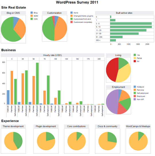
In a while I had a topic and some tools to get this small personal project going - I took results of large WordPress survey that run last summer and tried to shape it into visual reflection of community that took survey.

So after some serious struggles with data aggregation, defeating broken encodings and normalizing more currencies than I have ever seen in my life… I present you WordPress Survey 2011 in pie charts. And some bars.

WordPress survey results

Click through to for full dynamic version.

I will much aprecciate feedback how did this attempt go and probably will write about tools I used separately.

Related Posts

5 Comments

  • dan l #

    A few thoughts....but please keep in mind the following: -I'm not an expert. I'm not bad. But I'm no expert. -Data visualization people often times don't agree on much. -You're going about this the right way. When I started, I made a couple of not so awesome dashboards. I revisited it often until I had command of everything I thought I needed. -Nothing here is a rip. So, my thoughts: 1. What am I looking at? I mean, I know you know because you made it. I'm sure other wordpress people might know what they're looking at. But I don't. I actually had to go to the wp article and download the data all to figure out that these were developers doing a survey about their business. You may want to find a way to say that. 2. How did word press get to those dead developers? Oh and what exactly is a partially living developer? That's a 'funny' way of highlighting the issue. But this happens more than you think. In our efforts to reduce text, sometimes we leave chart legends that are muddled. Sometimes they're muddled in a funny way. And then some jerk says it to you in a smug way like that. I have a boss who did it to me just a few days ago. 3. I like the 3 tiered layout - separating the question categories in a meaningful fashion. That helps your reader. See point 1 to make sure it all ties together and clicks for your constituent. Layout means a ton in projects like this, imo. This will make you laugh: one of my more recent dashhboard projects has some elements inspired by.....rarst.net. 4. Data visualisation people will almost always tell you that pie charts are bad. They are often right. Sometimes they are not. I'm not real dogmatic about it and I don't encourage others to be either. But I would probably rethink those. 5. That center mass chart. Is there a better way to say that? Additional stuff: If you're interested and have a copy of excel 07 or 10 somewhere, I'd gladly try to whip up something just so show you another spin on it. I can't guarantee it will win awards, but it would just be my take on the data. Also, my guy Robert's site is probably a place you should visit: http://www.clearlyandsimply.com/ His site covers some great Excel and Tableau stuff.
  • Rarst #

    @dan l 1) This is definitely more for internal WP community consumption. I would probably go about this completely different if my goal was to extract info in a way that is meaningful to anyone. This on other hand is totally meant for fellow WordPress developer or power user. 2) My... did I screw up that heading or what. :) 3) Layout was born from desperate attempt to give it meaningful structure. Source data is crazy - survey branched roughly in three paths and asked very similar questions, but not completely same and worded somewhat differently. It took a lot of effort to aggregate that and not lose like third of answers here and there.
    This will make you laugh: one of my more recent dashhboard projects has some elements inspired by…..rarst.net.
    Made me more puzzled. :) I am of very low opinion about my visual/creative skills. Would be interested to see if that is a possibility, it is highly interesting how other people perceive my site. 4) That is probably way above my head. Despite having worked some with data visualization (on previous job) I am still firmly at a level of slightly interested techie from completely different area. 5) Hmmm... There probably is, but I got it quite close to what I had in my mind from the start (unlike other parts most of which had crashed and ended up different). I wanted to see for myself how hourly rates evolve with professional growth (since this is exactly process I am living through now) and I think it got displayed nicely. Few fellow WP folks on Twitter grasped instantly what I displayed there. Overall for a context for me this was also much about exploring Google Refine and Tableau. While I got on great with Refine I can't say same about Tableau. I like what it can do, but it is complicated from data perspective (my lack of relevant skills) and crappified as a software (they charge so much for full version, so free one is intentionally run into the ground).
    If you’re interested and have a copy of excel 07 or 10 somewhere, I’d gladly try to whip up something just so show you another spin on it. I can’t guarantee it will win awards, but it would just be my take on the data.
    I have trial of Excel 2010, currently need Word for project at work (WordPress development sure can take one to weird places...)
    Also, my guy Robert’s site is probably a place you should visit
    Bookmarked. Many thanks for extensive feedback! Much appreciated.
  • dan l #

    On 3: Yeah. Definitely messy data. It is quite the undertaking to make it potable. Oh and yeah. I've always thought your site looks pretty slick. What I like about it, mostly is the use of the oversized header and footer. It's really interesting because normally that's something of a turn off for me. I suspect it works on your site because it's light colors and has a simple thin spacer while the mast itself doesn't punch you in the face. Oh. And the stats board. I really like that. 5. An interesting question. I'll drop a copy of the data.
  • dan l #

    Amusing things you find in the data: when asked about his hourly rate, one user responded with "1 Six Pack". I guess that depends if they're talking about the good stuff or not.
  • Rarst #

    @dan l Saw that. :) It amuses me how that entry splits people in two categories - those that are worried about code getting written under alcohol influence and those that start to calculate how expensive stuff should be to make it worthwhile. :)